Add AI customer support to your Next.js app with one Server Component
A step-by-step tutorial for @clankersupport/widget-rsc: install the SDK, drop one component into your root layout, then restyle it with CSS or rebuild the UI entirely with headless primitives.
Support widgets have shipped the same way since 2015: paste a script tag before </body>, hope it doesn't fight your framework. In a Next.js app that means no types, no server rendering, a mystery global mutating your DOM, and a launcher that pops in after hydration.
We just shipped a better way. @clankersupport/widget-rsc is Clanker Support as a native React Server Components package: one component in your root layout puts a streaming AI support agent on every page, server-rendered into your HTML. And because the whole widget is built on headless primitives, you can restyle it with plain CSS or replace our UI entirely.
This tutorial takes you from npm install to a customized widget in about ten minutes.
What you'll need
- A Next.js 15+ app using the App Router (any React 19 RSC framework works; we'll use Next.js here).
- A Clanker Support project and its public widget key — grab it from the dashboard under Project → Embed. Self-hosting the open-source llmchat stack works too; you'll just pass your own
apiUrl.
The key is public by design — it's the same key the script-tag embed exposes — so it's safe in client code and env files.
Step 1: Install the SDK
npm install @clankersupport/widget-rsc
React 19 and React DOM are the only peer dependencies. The package itself has zero runtime dependencies — the streaming protocol, API client, and storage layer are self-contained, so your bundle barely notices it.
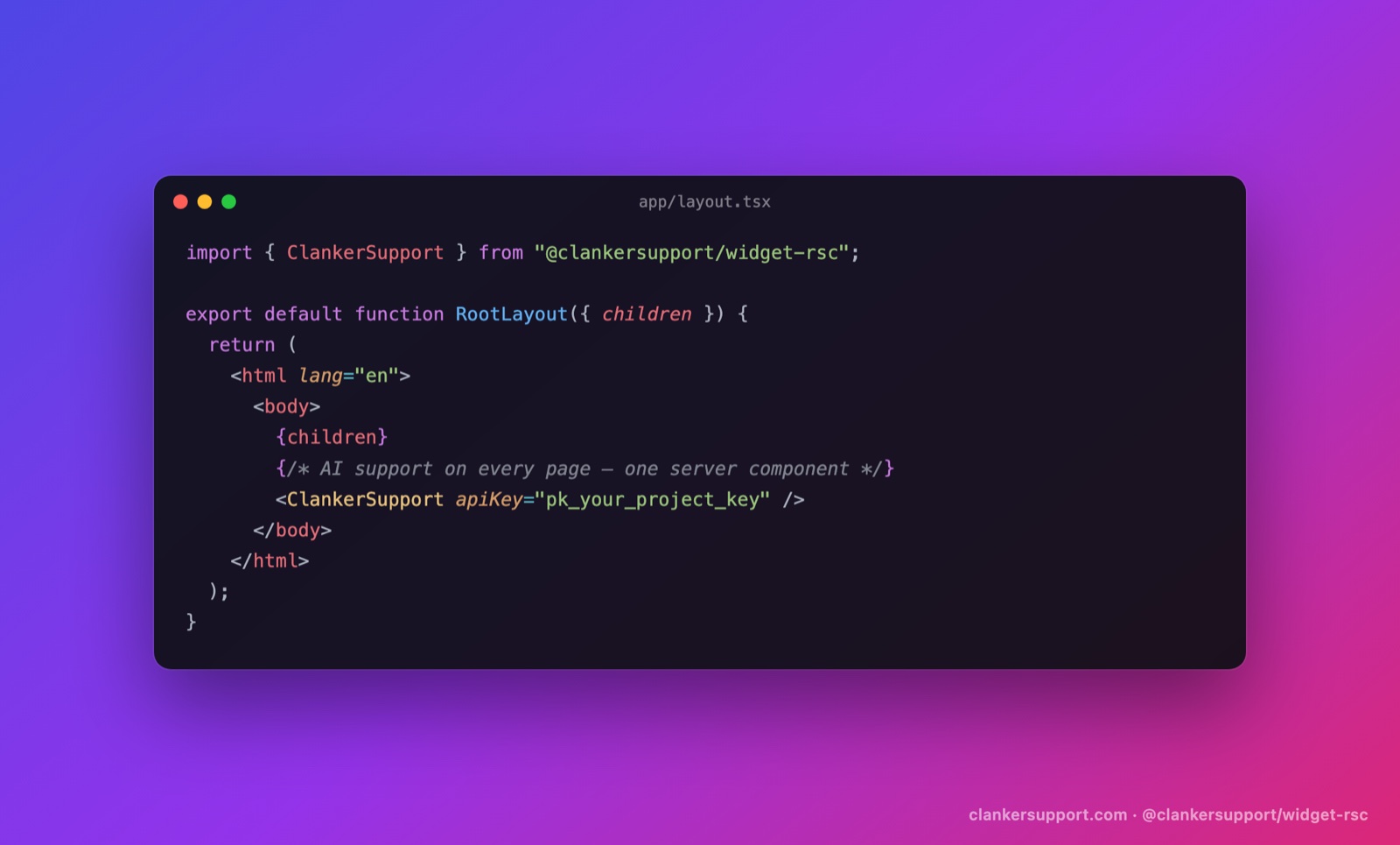
Step 2: Add the widget to your root layout
Open app/layout.tsx and render ClankerSupport just before the closing body tag:
import { ClankerSupport } from "@clankersupport/widget-rsc";

export default function RootLayout({
	children,
}: {
	children: React.ReactNode;
}) {
	return (
		<html lang="en">
			<body>
				{children}
				<ClankerSupport apiKey={process.env.NEXT_PUBLIC_CLANKER_KEY!} />
			</body>
		</html>
	);
}
Add the key to .env.local:
NEXT_PUBLIC_CLANKER_KEY=pk_your_project_key
Run next dev and open any page. A launcher bubble sits bottom-right; click it and you're chatting with your support agent — streaming answers from your knowledge base, with "Talk to a human" escalation and everything else the hosted widget does.
Here's what makes this different from a script tag. ClankerSupport is an async Server Component: it fetches your widget config (branding, privacy URL) on the server, cached and revalidated every five minutes, so the client skips a round-trip and never flashes the wrong branding. The fetch is wrapped in Suspense with a null fallback and fails soft — if our API is slow or unreachable, your page renders normally and the widget simply appears with safe defaults. A support vendor should never be able to block your page. Now it can't.
Step 3: Make it yours
Everything visual is a typed prop:
<ClankerSupport
	apiKey={process.env.NEXT_PUBLIC_CLANKER_KEY!}
	brandColor="#16a34a"
	position="bottom-left"
	title="Acme Support"
	greeting="Hi! Ask us anything about Acme."
	escalationThreshold={2}
/>
brandColordrives the launcher, header, and user bubbles.positiondocks the widget to either bottom corner.greetingis the opening bubble (it personalizes automatically once a visitor gives their name; passnullto hide it).escalationThresholdcontrols how many visitor messages appear before the "Talk to a human" option shows. Default is 3.
Step 4: Restyle with CSS
The default UI is plain, namespaced CSS — .clanker-* classes driven by custom properties, no shadow DOM — so your stylesheet always wins:
.clanker-root {
	--clanker-brand: #16a34a;
	--clanker-surface: #0b0f14;
	--clanker-text: #e5e7eb;
	--clanker-bubble: #1f2937;
	--clanker-border: #1f2937;
}
.clanker-panel {
	border-radius: 8px;
}
That's a dark-mode widget in eleven lines, no configuration UI required.
Step 5: Go headless when CSS isn't enough
The styled widget is a thin composition over primitives we export from @clankersupport/widget-rsc/headless — the same pattern as Radix: unstyled semantic elements, data-* state attributes, asChild support, and full prop passthrough.
"use client";

import * as SupportChat from "@clankersupport/widget-rsc/headless";

export function HelpButton() {
	return (
		<SupportChat.Root apiKey={process.env.NEXT_PUBLIC_CLANKER_KEY!}>
			<SupportChat.Trigger className="btn">Need help?</SupportChat.Trigger>
			<SupportChat.Panel className="panel">
				<SupportChat.Messages>
					{(m) => <Bubble role={m.role}>{m.content}</Bubble>}
				</SupportChat.Messages>
				<SupportChat.EscalateButton>Talk to a human</SupportChat.EscalateButton>
				<SupportChat.Composer>
					<SupportChat.Input placeholder="Ask anything…" />
					<SupportChat.Submit>Send</SupportChat.Submit>
				</SupportChat.Composer>
				<SupportChat.Branding />
			</SupportChat.Panel>
		</SupportChat.Root>
	);
}
And when even components are too much structure, there's a single hook that exposes the whole state machine — messages, streaming status, sending, escalation, ratings, CSAT:
"use client";

import { useClankerSupport } from "@clankersupport/widget-rsc/headless";

export function SupportShortcut() {
	const { send, status, canEscalate, escalate } = useClankerSupport();

	return (
		<>
			<button onClick={() => send("Where is my order?")}>Track my order</button>
			{status === "streaming" && <TypingDots />}
			{canEscalate && <button onClick={escalate}>Talk to a human</button>}
		</>
	);
}
Build a ⌘K support palette, a docked sidebar, a help tab inside your settings page — the SDK handles the protocol (streaming, polling, escalation semantics, optimistic ratings) and you own every pixel.
What you get out of the box
Whichever layer you use, the behavior is the full Clanker Support loop:
- Streaming AI answers grounded in your knowledge base (docs URLs, text snippets, Q&A pairs).
- Human escalation that emails your team and posts to Slack, with the bot going quiet while a human owns the conversation.
- Operator replies from the dashboard inbox appearing in the widget live — no refresh.
- Per-message thumbs ratings and an end-of-conversation CSAT prompt.
- A privacy notice, identity capture, and conversations that survive reloads.
One detail worth knowing if you're already using our script tag: the SDK uses the same browser storage keys, so switching to the React package keeps every existing visitor conversation and identity. Migration is deleting one script tag and adding one import.
Self-hosting
Everything above works against your own deployment of the open-source stack — pass your API origin and you're done:
<ClankerSupport apiKey="pk_…" apiUrl="https://support-api.your-domain.com" />
The full API reference — every prop, primitive, and hook field — lives in the package README. If you build something with the headless layer, we'd genuinely like to see it — come show us in Discord.